This month I'm taking a look at work by Rusty Dornhecker of Red Tree Gallery in Columbus, Ohio. Rusty was a tattooist around 20 years ago, but (he feels) under the wrong circumstances and the wrong teachers. So for a period he had quit tattooing and pursued other professions for a while before tattooing pulled him back, this time working with a team of world-class artists under the leadership of veteran tattooer Durb Morrison. So the work we are seeing here is from the early months of this second apprenticeship. Rusty has submitted a variety of pieces including a traditional devil, a fineline dreamcatcher and a realistic biomech skull... which gives us plenty to talk about.
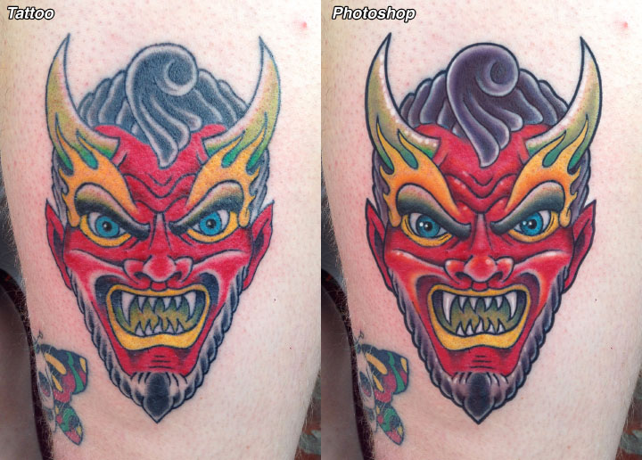
Let's start with the devil head. It's a nice design and a relatively clean, solid application. You can see a little patchiness in the shading and color, although the glare in the photo hides some of it. This lack of saturation will gradually go away as the months of tattooing experience pile up, and generally it's better to have a few holes in the color than to overwork a piece. However, one option many tattooers are not aware of is that they can go back in with the liner turned down low after the color application and use it to carefully saturate the tight corners and hard to reach areas- this could have contributed to a more saturated look. Note how in the retouched version I've included an orange-red in places to add some warmth, along with a deep red to transition better from the red to the black shading.
There are other places that color could have been saturated or deepened more: note how I've added orange to the eyebrow flames to separate them better from the eyebrows, and deeper greens in the horns to separate them from the flames more. In both cases I was addressing a light-on-light, or negative-on-negative situation- normally I try to make sure that neighboring shapes are of a different value. I've also added dark purples into the hair to deepen and cool it and to contrast all the warm colors in the piece.
It looks like the lines around the horns and hair have been built up a bit, which can help to make a piece bolder and cleaner looking. Lines that are built by carefully walking over the first pass line will often last much longer than single-pass lines before the major blowouts and dropouts start to happen, so I generally build up all of my thicker lines as opposed to just hammering them in with a fat group. Having several line weights in a tattoo can contribute to its graphic clarity and power; for this one I would recommend three line weights: single pass lines done with a thin liner group, single pass lined from a thicker needle group, and built up lines done using the thicker group. Note how in the retouched version the outermost line is fairly bold and built up, while the lines around major inner features such as the eyebrows and mouth are medium weight, while fine details such as hair and wrinkles are the thinnest weight.
There are also a few white highlights, applied with the thick liner for clarity and sharpness, to accent the piece in just a few select places. This adds just a touch of sparkle; on top of the greater color saturation and the bolder, more developed lines it makes for a striking graphic look.
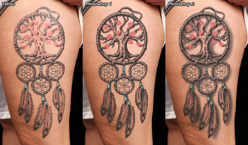
Next comes the dreamcatcher. It's a nice size and layout, and my guess is that the client is very happy with it. It's a fairly light overall look, which may have been what she was looking for, but I think that it's a little insubstantial, both in the application of the linework and in the use of shading, which doesn't utilize the whole value range. And then there are those flowers, which are almost nonexistent. So let's go over a few ways to make this piece stronger without sacrificing the lighter overall appearance.
One thing that I changed right away was the lines in the dreamcatcher webs. I think they should be gray lines, possibly using a medium opaque gray for uniformity. This sets those lines apart from the black linework defining the major shapes of the piece, and makes it easier to carefully walk over any parts that might need smoothing out (those lines are the most challenging and in this piece, the most visibly imperfect). I would also recommend graylining the detail lines in the stuff wrapped around the four rings.
I've then gone and strengthened all the black linework. This would be done by walking carefully over those lines with the same thin group that they were started with, using hand motions like you would with a colored pencil under relatively low power. This is methodical and takes time, but the results are well worth it and will stand up nicely to the test of time. Then more shading is added, particularly in the tree. Note how dark shading is used to give the tree strength and to set it out from the background. Dark shading is also used to separate the feathers from each other.
Next, the liner (or possibly a larger round group) is used to work the details through the rings, feathers and tree, working with both black and gray and approaching it like a pencil drawing. Two things happen during this stage: Detail is added and developed, and the overall strength of the large shapes is clarified. When the black is finished, reds and darker pinks are used to develop the flowers, giving them as much simple graphic punch as possible without using black. Finally, white highlights are added in the flowers and in other places through the piece to give it a touch more substance.
Anyway, that's the first of the two retouched versions; you can see that there is a second version where I've added a soft dropshadow. This not only makes the whole piece lift off the skin, but serves the purpose of making it appear more substantial as well. Note how the shadow has been kept soft enough that it doesn't smear together with the rest of the tattoo and threaten its clarity. Sometimes opaque grays will give more predictable results in cases like these.
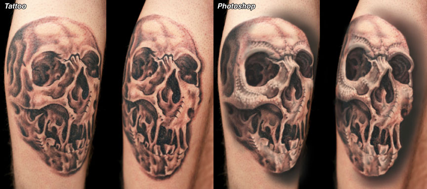
Finally, let's take a look at that skull. You can see that there are a number of visible differences between the original and retouched versions. The biggest and most obvious one is what I refer to as the large-scale distribution of dark and light in the piece. In the original, you will find similar amounts of shading throughout the whole tattoo. There are some darker details and some lighter details, but from a distance, the overall appearance is just a little cluttered and fragmented. So that's the first thing we'll address.
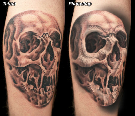
Note how deeper black has been added to areas that are already dark such as the eye sockets, nose, under the cheekbone, and the shading behind the right side of the face. These are all big areas of shading, done with a large mag, and in these areas no details are left unshaded. At the same time, the light areas are left lighter. The big dark areas make the light zones appear lighter; the big open light areas make the dark zones look darker. Contrast is a thing which happens best on a large scale- too many small shapes with too much of the same shading happening and it doesn't matter how much black you've used, it will be hard to read. Contrast is about difference, so the greater the difference you have between your dark and light areas, the better... and at the largest scale possible. Note how the gradient to the right of the face is five times longer than the gradient in the original tattoo... long gradients provide depth and smoothness that can't be achieved with smaller, patchier shading.
With this in mind, I've tried to do all the detail work in such a way as to not close up the light areas with dark detail, or to bring highlights into the dark zones in a way that cancels out their effect. Detail and development in the light areas is done primarily with grays. Since the skull has a few biomech details I went ahead and ran with that effect a little further on the forehead and cheekbone, mainly using those pencil-style hand movements that are so key to rendering this kind of realistic effect. There's plenty of room for interesting detail, as long as the overall form of the skull is kept in mind the whole time.
So, Rusty: Keep up the good work... You've got nice drawings and are on your way to doing a solid tattoo. If you were to take anything home from this, I would say to spend more time with your liner, in some cases after you've done your shading, and to develop your lines, details and edges more, so that your work is just a little more rendered and solid looking. Think larger scale with your shading too... that's an important one. All in all, though, you are well on your way.
