The work we're looking at today is by Mason of Blue Tattoo Cafe in San Diego, CA. He says: "Being a self taught artist of three years and a shop owner, I never pass on the opportunity to have another artist critique my work. I really appreciate you taking the time to read me email. Its hard in my position to progress my art and find other artists to work with. They’re either too busy or just not interested in helping another artist get better...I like to really push myself hard to be the best artist for my clients."
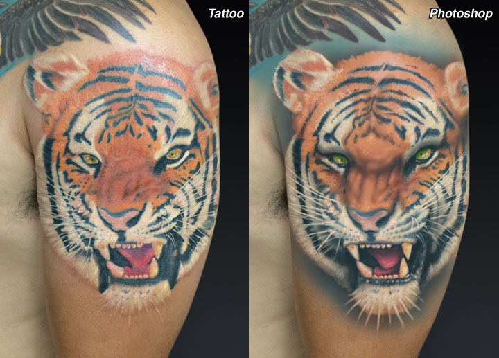
In this first piece, a classic tiger face tattoo done with a no-outline approach, there's a good chance this tattoo will lose all its distinction over the course of a few years (or a couple good sunburns). That's a shame, because it's a nice design with a good facial expression. The whisker detail has got some potential as well. So starting with those positive points, let's look at ways to strengthen the tattoo overall.
Anyone who has read any of my other critiques by now has seen me recommend background gradients to pop out light-colored objects like this tiger. That's one of the biggest changes I've made in the Photoshopped version on the right. I've chosen a medium value, not all the way black, so that the black in the stripes will have a chance of standing out better. Instead, it's a medium gray mixed with some smoky blue colors, based off the blue background in the chest tattoo. With the tiger piece, I recommend a muted blue rather than a primary one to keep the piece from looking like a stick-on cartoon tattoo.
The gradients are darkest immediately behind the head, especially behind any white parts, since white against untattooed skin just doesn't offer enough contrast. It's a big simple background gradient with no detail, made as soft as possible using a light touch. This softness allows the detail in the face to pop out more. There are some other areas of shading as well- especially around the eyes and nose, which give them a lot more depth to their expression- and behind the whiskers to either side of the mouth, which pops the teeth forward and gives the whole face more depth. Notice how these areas of dark shading make the light areas of the tattoo appear lighter.
Those are the bigger, more structural gradients. Then there's detail: darker stripes, darker mouth, and lots of careful refinement around the mouth, nose and whiskers, plus a few small point highlights. The one technical thing I'll mention here is that it can be helpful to switch back and forth between needle groups more often, allowing the full range of options that your brush selection allows for. In particular, liners can be great for doing detail work after a lot of the color and shading are in place. If you want to see a lot more of what I'm talking about, check out my Technique DVD set at TattooEducation.com, which is available to professionals only.
Most of the changes I've shown could be done to this tattoo if the client were to get back in the chair for a second go. Another 2-3 hours could transform this tiger into a showcase piece.
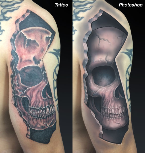
The second tattoo, the California skull, is a fun and clever design with a lot of potential for great depth effects. It's a simple clean application which no doubt is getting plenty of compliments, but I'd like to demonstrate ways of creating the strongest visual impact and really make the most of the optical possibilities of this design.
Let's start with the way I've used lines in the Photoshopped version on the right. Strong lines, when used selectively, can give a tattoo a lot of depth, with the outlined items popping out the most. So the California cutout is given the strongest line, one that is probably best done by building gradually rather than in a single pass. Then certain select elements of the skull are given a medium-weight line, and remaining details such as teeth and cracks are just started with a grayline, which can always be selectively darkened later as needed.
Next, in the background I've gone with deep gradients rather than solid black, since gradients tend to fool the eye into seeing more depth than a flat value will. Large areas of soft shading are applied in the skin all around the piece, which allows for the high lit edge in the cutout on the left side and helps integrate the tattoo with surrounding work better, getting away from the floater look a little.
Then there's a lot of differences in the way the skull itself is shaded. Without getting too specific, it's shaded in a way that demonstrates as much volume as possible. The drop shadows that the California cutout is casting on the skull are another important part of the depth effect, easily creating a sense of clear separation between the layers.
As far as the specifics of the shading go, I'd like to take the time to say this: You are only going to shade something as well as you can draw it. In art school, students are sat down in front of objects such as white spheres and cubes, and are asked to shade them exactly as they see them. This exercise could be built upon to include drawing found objects such as rocks and skulls. Ideally, these objects should be placed in a lighting situation that gives them good areas of highlight and shading; then the student sits and carefully records the image on paper using a variety of pencil hardnesses. These basic exercises can potentially open up a whole new language for you.
With all the areas of large shading done, details are added selectively. This includes some white highlights, mainly done with the liner to keep them sharp. But mostly I've avoided white lines, which I think need to be used selectively. In the unretouched version of this piece, note how white lines are used along the edges of most of the shapes. Although this gives each edge strength, from a distance it leaves you with a lot of competing sharp edges. In addition, I've noticed that shapes tend to have more volume if you keep their highlights closer to the center rather than the edge; highlighting the edge can make a shape look like it's cut from card stock, while putting the highlights toward the center automatically suggests volume.
I don't think these changes could be done to this piece as it is now, but these are all ideas that can be applied to other future work. If there were one main lesson I'm hoping readers get from this, though, it's about the need for the strongest possible artistic foundation. No amount of technical training can bypass the need for good drawing skills, regardless the style you prefer. Doing simple exercises on paper or canvas can teach a lot about how light and shadow work, and every single one of these exercises can help improve you in some measurable way. Believe me, I still do these kinds of found object exercises regularly to this day. If I didn't feel growth from them I wouldn't bother.
