Greetings, and welcome to another Ask Guy critique column, where I'm hoping that by doing honest, constructive critiques of other artists' work I can help guide readers toward a better understanding of both designing and collecting tattoo work. In my past few columns, the work I've critiqued is already quite good, so it's provided a chance for me to dive a little deeper into design theory. Many tattoo artists arrived in the tattooing industry without a whole lot of art theory, and although it's not strictly necessary, some of the fundamental concepts about composition and balance apply to all visual arts, giving us a rich tradition of artistic development that we can tap into if we are willing to look into art history a little.
Last month I critiqued a cowboy boot piece, a fairly complex design, and used it as a chance to talk about positive/negative relationships (or pos/neg for short), which is a way of thinking clearly about where you place your darks and lights in a design to achieve maximum readability. If you don't have a copy of last month's Tattoo Magazine lying around, you can look it up at the Ask Guy archive at my educational website, www.tattooeducation.com. This month, I'm looking at an illustrative piece by up and coming artist Damion Cressy, who has a well-developed illustrative style and is looking to go deeper into developing something that is uniquely his. I found that many of his pieces are expertly drawn, with well balanced compositional elements and nice detail work. My main observation with many of his better pieces was that they could use more contrast in order to read as clearly as they should.
Contrast is a concept that I think has led to a lot of misunderstanding. Many artists have arrived at the idea that contrast equals using lots of black, which isn't strictly true. Black can be very helpful in establishing clear contrast, but only if used correctly. If equal amounts of black are used in all of the elements in a design, you can actually end up with less clarity, creating a dense and hard-to-read overall look. In reality, contrast is about difference... that is, when two neighboring shapes (foreground and background) are very different from each other- one is dark and the other is light, for example- then those objects will contrast each other. When lots of black is used in both the foreground and the background, it's true that you'll have a dark tattoo that won't fade easily, but the overall look might be dense and unattractive as a result. A strong rhythm of large dark and light shapes is key to creating attractive readability.
The tattoo that I'm critiquing does have some contrasting areas, but we are looking at ways to push that effect further and maximize it. My biggest issue is that the skull, grassy hill and background mountains all have very similar amounts of shading. The bold line around the skull is very helpful in separating the layers, but in my opinion, that alone is not enough. If you look at the tattoo from a distance, the skull disappears into the grass and the antlers merge with the hills in the background. I've put together three different alternate approaches that I believe make for a clearer piece, so let's take a look at each of them.
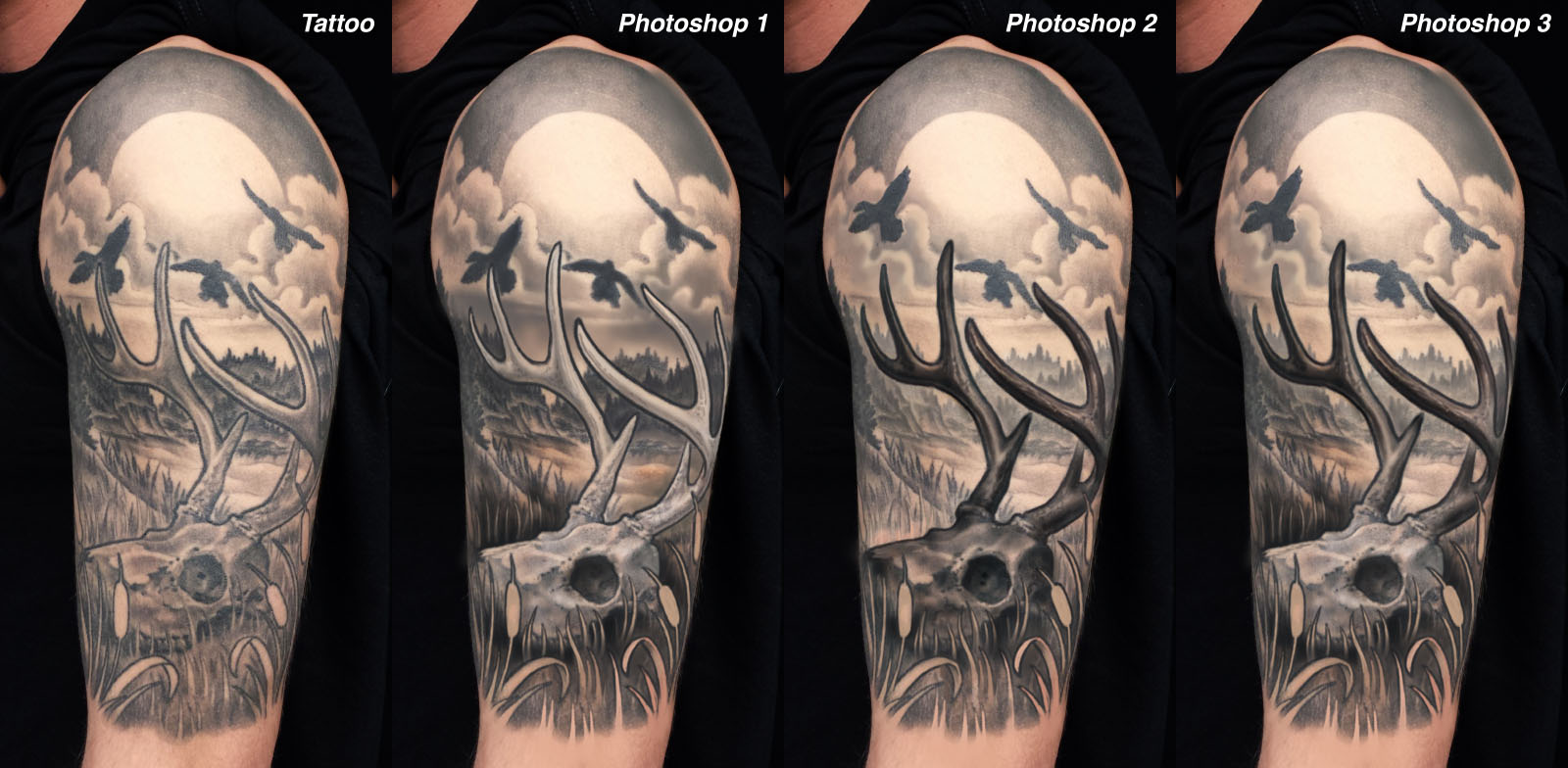
The first one, labeled Photoshop1, is following a basic neg on pos approach- that is, the skull and antlers are all shaded significantly lighter than the immediately surrounding background areas, and the closest background has been darkened to contrast the openness of the skull. This includes some subtle medium grays in the sky and water just behind the antlers, plus a careful darkening of the distant hills to deepen them in relation to the antlers without going quite as dark as the deep foreground. The skull and antlers have been handled with much lighter shading than the background, helping them to stand out from the medium and dark tones behind them. The only true black within the skull is in the eye socket, which gives the skull more form and makes it easier to identify what it is.
The second example, shown in Photoshop2, follows the opposite approach, going with a clear pos on neg strategy. This means going significantly darker with the skull and antlers, using true blacks in the undersides of these shapes and darker washes pulled right up agains the edge of these shapes- that is, I'm not leaving much of that that "tattoo gap" in the shading between the outline and the darkest shadows. You can see a little bit of this gap in a few places, such as the undersides of the antlers, but the gap is shaded to a medium dark tone instead of leaving it blank skin. This makes the skull look a bit more densely worked, which is fine provided the background is left open enough. For that purpose, the distant hills are kept very light and are allowed to drop out almost completely before disappearing behind the skull and antlers. This kind of misty effect can create a very convincing sense of distance- in art school, they refer to this trick as atmospheric perspective, and many tattooists use this tool to great effect.
Finally, in Photoshop3, I've made a version which uses a bit of each of the other two strategies. I refer to this as a dynamic pos/neg relationship, where the positive/negative approach changes throughout the piece. In this case, the skull is kept light and open, which helps it to look more like a skull (the pos on neg approach in Photoshop2 is nice and readable, but the dark skull looks less realistic). Then, the upper parts of the tattoo switch from a neg on pos skull to some pos on neg antlers, which causes them to jump forward and the background to drop off into the distance. I think this mixed approach combines the best of both worlds, giving us both strong clarity and a good sense of open outdoor space.
You may notice that I've also moved one of those birds, since the one that goes behind that antler point I think looks a little crowded. I do think it's helpful to have a few dark shapes in this upper area, so the birds offer a useful element toward compositional balance, keeping the upper part of the piece from being too open or empty.
There are many potential ways to shade a design, and very few could be considered "right" or "wrong". However, by being decisive about what your pos/neg strategy is and using that to come up with an approach for maximum contrast, you can make your work more bold, readable, and long-lasting.
