


New Ask Guy Column Addresses Issues of Design Strength
Friday April 08, 2016
Speaking of pos/neg relationships, that's a topic that I cover in detail in my educational app, Reinventing The Tattoo, which will be available at its special introductory rate for just another few weeks. The beginning chapters of Reinventing dive deeply into fundamental design concepts ranging fro flow/fit to pos/neg relationships, contrast, color, outlining, and the use of other graphic tricks to give your work visual clarity and make it dynamic. The later chapters then get into very specific technical territory, making Reinventing The Tattoo the most comprehensive educational package available in the tattoo industry. You can read more about it at ReinventingTheTattoo.com. More material is about to be added, including a massive section on coverup tattooing. Now is your chance to subscribe and get all this material for a discount rate; introductory pricing ends soon. 

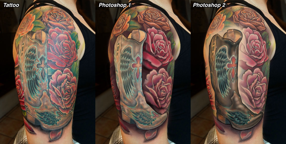
I've always enjoyed doing critiques of other artists' work, since critiquing is often one of the most direct ways to find the most obvious ways for an artist to improve. In my last critique column for Tattoo Magazine, I went a step further and did a critique that is specifically aimed at illustrating one of the key concepts in making a strong, readable tattoo design: Positive/Negative relationships. When I talk about pos/neg relationships, I'm addressing the idea of how the dark and light values in a piece are distributed in order to get the most clarity. It's a concept that I think many artists could benefit from, since it can affect many aspects of a tattoo ranging from across-the-street readability to its long term aging prospects. The piece that I critiqued for the purpose is nicely drawn, but by thinking more specifically about its pos/neg situation, there are ways to make it pop much more strongly. You can read more in the current issue of Tattoo Magazine, on newsstands now, or you can check it out in the Ask Guy archive at TattooEducation.com.